Total Pageviews

Sunday, 19 October 2014

The colour

I have found a detailed explanation about how our brain understands colors.

Color vision is an illusion created by the interactions of billions of neurons in our brain. There is no color in the external world; it is created by neural programs and projected onto the outer world we see. It is intimately linked to the perception of form where color facilitates detecting borders of objects.
Color is created by utilizing two properties of light, energy and frequency of vibration or wavelength. How our brain separates these two properties of light, energy and wavelength, and then recombines them into color perception is a mystery that has intrigued scientists through the ages. We know much about the nature of light and the subjective impressions of color, definable by physical standards (Wright, 1946) but ultimately color should be explained at the level of single cells in our brain. Examination of the responses of single neurons or arrays of such neurons provides the best insights into the physiology of color vision. Ultimately our understanding of this process will allow us to model the neural circuits that underlie the perception of color and form. Although still beyond reach, progress is being made in deciphering these clever circuits that create our perception of the external world.
We start by describing the nature of the photoreceptors that convert light energy into neural signals. Then we consider the parallel channels leading from the retina to the thalamus carrying information into visual cortex, where color is ultimately determined. Lastly we use our current understanding to speculate on how visual cortex uses neural circuits to create the perception of color and form.

(http://webvision.med.utah.edu/book/part-vii-color-vision/color-vision/)


For example, a tomato lighted by white light looks red. This is because tomatoes reflect red light. As seen in this example, objects have unique physical properties that reflect or emit light of specific wavelengths. Humans may seem to relate the wavelengths to color in the process of perception. However, this is not the case. Even if we light a tomato with blue light so that red light does not reflect, humans perceive tomatoes as red objects, not blue objects.


(http://www.jp.honda-ri.com/english/projects/intelligence/02.html)

Basic color theory


Color theory encompasses a multitude of definitions, concepts and design applications - enough to fill several encyclopedias. However, there are three basic categories of color theory that are logical and useful : The color wheel, color harmony, and the context of how colors are used.Color theories create a logical structure for color. For example, if we have an assortment of fruits and vegetables, we can organize them by color and place them on a circle that shows the colors in relation to each other.


The color wheel


A color circle consist of red, yellow and blue colors. In 1666 Sir Isaac Newton developed the first circular diagram of colors.There are also definitions (or categories) of colors based on the color wheel. We begin with a 3-part color wheel.


Primary Colors are basic colors, with no mixture of any other color (red, yellow and blue). Mixing them with each other, receiving all other colors.

Secondary Colors obtained by blending equal parts of two primary colors. In this way it appears a green, orange and a purple color.

Tertiary Colors are made from mixture of one primary color and one secondary color. It appears reddish-purple, blue-purple, blue-green, yellow-green, yellow-orange and reddish-orange color.


Some formulas for Color Harmony 

There are many theories for harmony. The following illustrations and descriptions present some basic formulas.

1. A color scheme based on analogous colors


Analogous colors are any three colors which are side by side on a 12 part color wheel, such as yellow-green, yellow, and yellow-orange. Usually one of the three colors predominates.


2. A color scheme based on complementary colors


Complementary colors are any two colors which are directly opposite each other, such as red and green and red-purple and yellow-green. In the illustration above, there are several variations of yellow-green in the leaves and several variations of red-purple in the orchid. These opposing colors create maximum contrast and maximum stability.

3. A color scheme based on nature


Nature provides a perfect departure point for color harmony. In the illustration above, red yellow and green create a harmonious design, regardless of whether this combination fits into a technical formula for color harmony.

Color Context

How color behaves in relation to other colors and shapes is a complex area of color theory. Compare the contrast effects of different color backgrounds for the same red square.


Red appears more brilliant against a black background and somewhat duller against the white background. In contrast with orange, the red appears lifeless; in contrast with blue-green, it exhibits brilliance. Notice that the red square appears larger on black than on other background colors.


Different readings of the same color


If your computer has sufficient color stability and gamma correction (link to Is Your Computer Color Blind?) you will see that the small purple rectangle on the left appears to have a red-purple tinge when compared to the small purple rectangle on the right. They are both the same color as seen in the illustration below. This demonstrates how three colors can be perceived as four colors.


Observing the effects colors have on each other is the starting point for understanding the relativity of color. The relationship of values, saturations and the warmth or coolness of respective hues can cause noticeable differences in our perception of color.


(http://www.colormatters.com/color-and-design/basic-color-theory)

Saturday, 18 October 2014

Highlighters and shaders

Where to highlight and where to contour depends on face shape, size and colouring. As a general rule, highlighters enhance features, shading detracts from features. There is my work on my classmate. You can definitely see the differences between contoured side and plane side. On the contoured and highlighted side the cheekbone got sharper and the nose got nicer shape as well. I think that highlighters and shaders are very important in the makeup, because you are giving the shape to the whole image


There is the basick sheme where to highlight and where to contour.


And here is the scheme for four different head shapes.


Foundation

1.Observe the model's face colour and compare it to the colour of her arms and torso. Your aim is that the face and neck should look as if they are part of the same person.
2. Choose the right colour for your model, either by choosing a single colour, or by mixing different colours together on a palette. Test on the side of the face/jaw line. Once you have the right colour, use either a sponge or a brush and start to apply the product from the top, working downwards and outwards.

Here is two pictures before and after foundation. Sometimes it is a little bit difficult to find the right colour, especially if you are mixing few colours, because every single shade of colour changes the basic color and it can look wrong. That is why it is very important to find the right colour. And the foundation color is correct when it merges with the skin color.


Face cleaning


We had a lecture where we learned how to correctly clean clients  face before doing makeup. That picture was made during and after face cleaning process.

The most important thing about doing your makeup is to start of the fresh face. First of all you have to start with consultation notes about clients skin type, skin tone, eye colour/shape, allergies/medication, contraindication.
You need : Cape, Cleanser, Tonic, Moisturiser, Ear pics, Baby wipes (if you need), cotton wool pads. Here is few steps of 
how to correctly clean the skin before makeup.

1.Wash your hands and prepare the model by placing a hairband around the hair to expose all the face and neck areas to be cleansed.

2. Start by cleansing eyes, one at a time with cotton wool pads.  The eye area is cleansed in circular movements, outwards over the upper lid, and then under the lashes towards the nose. You have to repeat a few times until the cotton wool pads are clean, and all the old eye make-up has been removed.

3. Apply cleanser to the face. Start from the neck upwards, towards the forehead, use long sweeping and light circular movements, gently massaging the product into the skin. Avoid sensitive areas around the eyes.

4. Remove the cleansing thoroughly with clean damp cotton pads, again working from the neck upwards and outwards. Concentrate on the areas around the nose, in the lines of the forehead and in the crease of the chin, where old make-up accumulates. Repeat until the damp cotton pads are clean, and all cleanser has been removed from the skin.


5. Apply face with moisturiser and massage into the skin.


Sunday, 5 October 2014

Induction week

At the first week we have got an orientation exercise. It was three tasks. The first one was about our summer project. Our second task was to find different locations and to take a ''Selfie'' outside the location using our phones and upload these images in our new sketch blogs. The third one was to go to ''West Quay Shopping Centre'' and to find few brands of makeup stores. ''Bobbi brown'', ''MAC'', ''Laura Mercier'' and ''Benefit''.


So me and two classmates Tina Pun and Naomi Parsons were walking to look for those places. Since all women love shopping, it was easy to find ''West Quay Shopping Centre'', because we already knew where it is.


It was a little bit harder to find ''The Mayflower Theatre'', but eventually we found it.


And the last location was ''Southampton City Art Gallery'' . We have been walking around this building and tried to find the name on it. We found it.


Here is brand stores , what we had to find.


We had another lesson. We had to be grouped in two or three people and create a make-up. We also had to come up with a story of makeup. I was in a group with Martina and Shanzy Hanif and we made couture aztec makeup with a story which says ''Aztec princess was killed, but she rose from the dead and now she is looking for her prince''

We had an interesting lecture, where the member of ''Illamasqua'' represented their product and talked about career opportunities.


''Illmasqua'' member presented ''Illamasqua'' makeup possibilities on one of Makeup and Hair design student.


My summer project


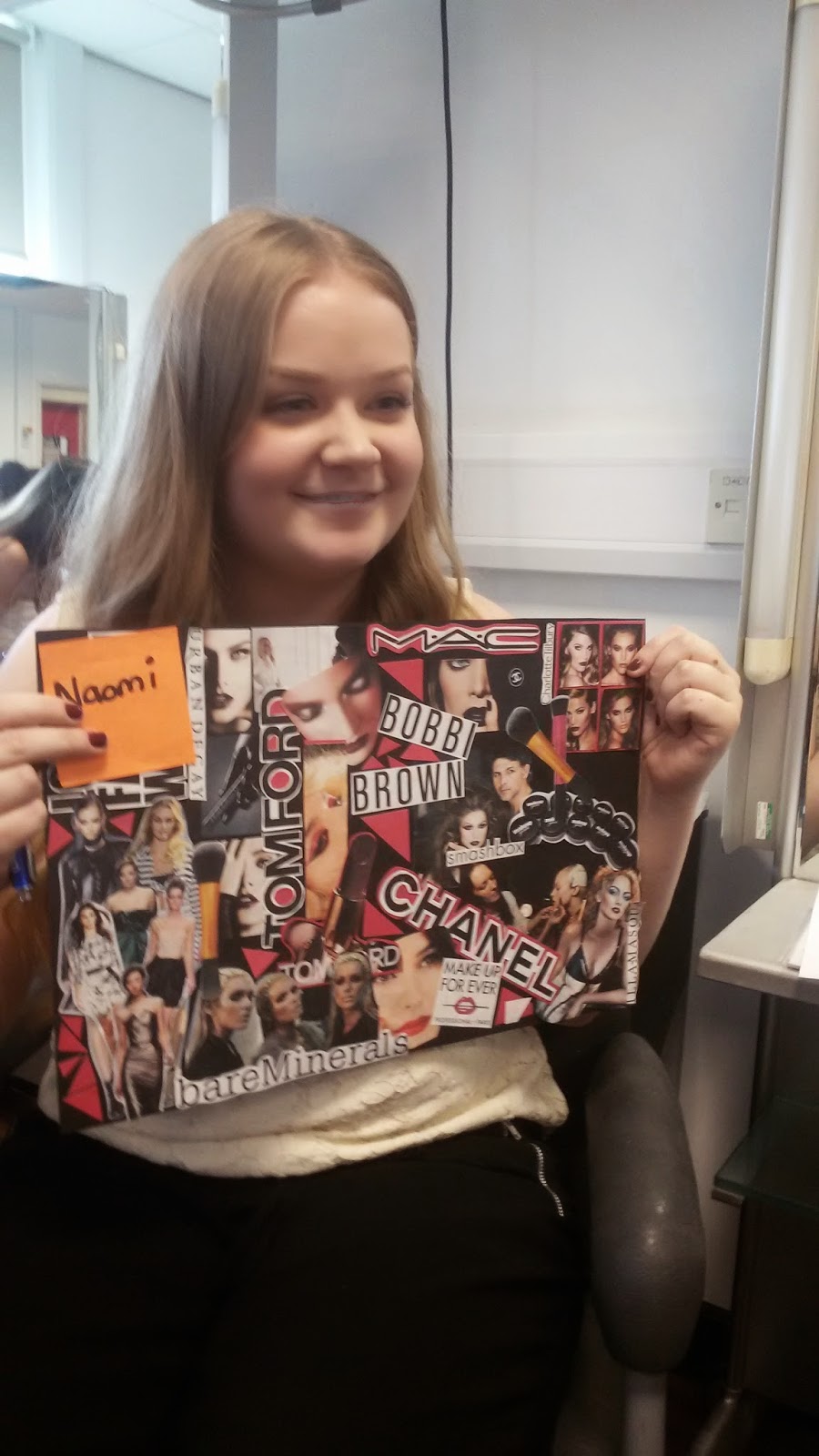
I created a collage/mood board that represents my interests and desires. In the future, I would like to have my own beauty studio where I could work. I would also like to find the time to travel around the world and get some inspiration and ideas for my work, which would bring joy to both me and my clients. That I would be even more happier, stronger and healthier I will be exercising every day. A healthy body - healthy mind.


The day when we had to present our mood boards, we were split into groups. In my group there was Tina Pun, Naomi Parsons, Toby Oldfield, Molly Haywood and me. Each of us had to talk about our mood boards. We have had the opportunity to get to know each other and to hear each other's hobbies and desire. I think the task was interesting and fun. 


Introduction to project


There are so many queens in the world. Even Elizabeth 1 had three thousands dresses, you could never be able to confuse with any other queen. She was an exceptional beauty queen. Her white skin and red hair had become historical.
Some of the facts in her biography are unknown, like the fact as why she remained unmarried?! This just makes it more mysterious and interesting. I made a collage of some Elizabethan's pictures to visualise that not a single dress can overshadow her exclusive beauty.


This is a short video, how to create image of Elizabeth. I love this video, because in a very short time you can see metamorphosis (from a simple old lady to England queen). Here is shown her looks basic details such as big red wig and white skin (powder), that makes an Elizabethans image. You can also see that the make-up artist shaving models hairline, therefore the forehead would look wider. The make-up artist using a big, curly and messy wig and some accessories, even so it reflects the real image of Elizabethan. 


Tudor Make-up


Elizabeth had a significant influence on the appearance of people, especially for women.  The rich women of the Tudors wore makeup as an indication of their status and rank. Makeup also had a practical use to hide the scarring of various diseases such as smallpox.

Elizabethans face  was enhanced by ceruse, a concoction of finely ground white lead powder, mixed with vinegar and applied over the entire face and neck. It created a luminous white, perfect, capable of smoothing away pockmarks, wrinkles and blemishes. Even it was a deadly poison, it was very popular at the time.

The red cheeks was very important as well. It was made of red ochre and brighter shades was achieved by a white lead base dyed with red crystalline of the plant ''Alkanna tinctoria'', which gave a deep burgundy.

Her lips were rouged with a pencil of ground alabaster or plaster of Paris mixed with a colouring agent, usually alkanet, cochineal or the dye from the East Indian brazil tree. Fetching porcelain shine was from the glaze of egg white.

Elizabethans high forehead was kept safely from the sun. It was very important to keep her skin white as milk, because her forehead was aristocrats ideal.


(''Beauty and cosmetics 1550-1950'' p.11-15)